
About
Data by itself has no meaning unless its given context to help aid better understanding for decision-making. Increasingly data needs to be visually represented to improve everyday analytics and service operations.
We look at data from multiple perspectives ie. a service operator, customer and decision-maker to create a holistic point of view.
How does it work?
Smart Data visualisation analysis:
Step 1: map the data flows and activities.
Step 2: track the user journey of a piece of data through the organisation.
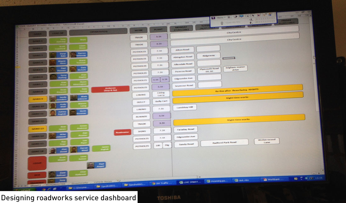
Step 3: model the data that is collated, measured and analysed for daily operational flow.
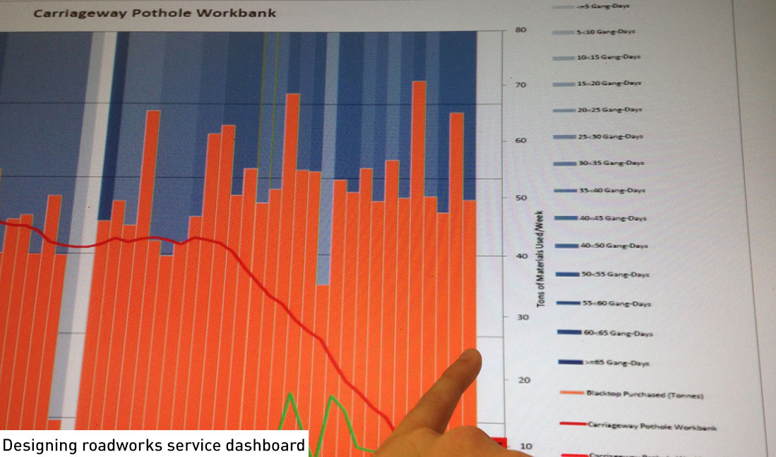
Step 4: data is then visualised and synthesised for daily service reference.
Step 5: data can be presented with existing reports or visualised as decision aid tools.
Benefits
Data visualisation is well known , but in the field of smart real time data - where data is inferred from sensors, crowdsourced data and operations - the nearest reference is the finance industry.
The key benefit is a holistic view of data which impacts daily operations and deceision making mapped to people's every days jobs and activities so they have a one to one mapping of how their action impacts the organisational flow and service delivery .
Pilot cities & neighbourhoods: Plymouth, UK
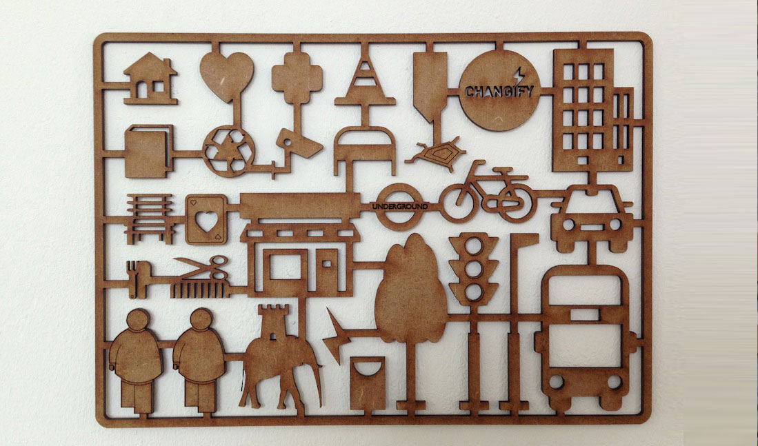
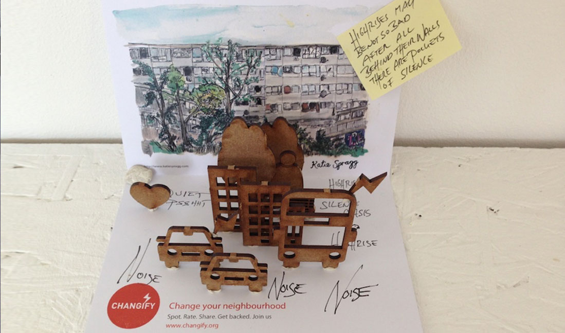
Projects: Changify Smarter Streets,
Clients: Amey-Ferrovial, BBC, Samsung Labs